
HubSpotモジュール:機能セクションモジュール
このモジュールは、製品やサービスの特徴を視覚的に紹介するために設計されたものです。画像とテキストを交互に配置するレイアウトを採用し、スクロールに連動したアニメーションによってユーザーの関心を引きつけます。
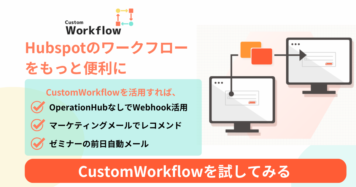
Demo Video

Detail
目的
- 製品の機能や利点を ストーリーテリング形式 で魅力的に伝える。
- 事例紹介や顧客の声 を写真とともに説得力をもって提示する。
- サービス提供プロセスやワークフロー をステップごとに説明する。
機能
- 「画像」と「見出し/説明」セットを無制限に追加・削除・並べ替え可能。
- 各セットごとに画像の位置(左または右)を選択可能。
- セクション番号、副題、タイトル、説明文について、テキスト内容・色・フォントサイズを完全に制御可能。
- スクロール時に要素がビューポートに入ると、フェードインアップアニメーション が適用される。
実装ポイント & 注意事項
- リピーター: 複数のコンテンツボックスを追加できるようにするため、
fields.json内で"type": "group"と"occurrence"プロパティを利用。 - レイアウト制御: グループ内の Boolean フィールド
"image_on_left"の値に基づいて、HubL の if 文で特定の CSS クラス(例:layout--image-left)を HTML に出力し、レイアウトを制御。 - アニメーション:
IntersectionObserver APIを利用する専用 JavaScript ファイルが必要。要素がビューポートに入ったことを検知し、.is-visibleなどの CSS クラスを追加して CSS トランジションを発火。 - スタイリングオプション: グローバルスタイル設定(テキストカラーやフォントサイズなど)は「STYLE」タブ内のカラーピッカーや数値フィールドで管理され、HTML のインラインスタイルとして適用される。
フィールド定義 (fields.json)
このモジュールは、以下のフィールド定義によって構成されている。
[
  {
    "name": "boxes",
    "label": "Content Boxes",
    "type": "group",
    "occurrence": {
      "min": 1,
      "max": null,
      "default": 2
    },
    "children": [
      {
        "type": "image",
        "name": "image",
        "label": "Image",
        "responsive": true,
        "show_loading": false
      },
      {
        "type": "text",
        "name": "section_number",
        "label": "Section Number"
      },
      {
        "type": "text",
        "name": "subtitle",
        "label": "Subtitle"
      },
      {
        "type": "text",
        "name": "title",
        "label": "Title"
      },
      {
        "type": "richtext",
        "name": "description",
        "label": "Description"
      },
      {
        "type": "boolean",
        "name": "image_on_left",
        "label": "Place image on the left",
        "display": "checkbox",
        "default": false
      }
    ]
  },
  {
    "type": "color",
    "name": "title_color",
    "label": "Title Color",
    "tab": "STYLE"
  },
  {
    "type": "color",
    "name": "subtitle_color",
    "label": "Subtitle Color",
    "tab": "STYLE"
  },
  {
    "type": "color",
    "name": "description_color",
    "label": "Description Color",
    "tab": "STYLE"
  },
  {
    "type": "number",
    "name": "title_font_size",
    "label": "Title Font Size",
    "suffix": "px",
    "tab": "STYLE"
  },
  {
    "type": "number",
    "name": "subtitle_font_size",
    "label": "Subtitle Font Size",
    "suffix": "px",
    "tab": "STYLE"
  },
  {
    "type": "number",
    "name": "description_font_size",
    "label": "Description Font Size",
    "suffix": "px",
    "tab": "STYLE"
  },
  {
    "type": "number",
    "name": "section_number_font_size",
    "label": "Section Number Font Size",
    "suffix": "px",
    "tab": "STYLE"
  }
]
Source Code
HTML
{# ======== module.html (with font size adjustment feature) ======== #}

<div class="feature-section-module">
  {% for box in module.boxes %}
    {% set layout_class = box.image_on_left ? 'layout--image-left' : 'layout--image-right' %}

    <div class="feature-box animated-box {{ layout_class }}">

      <div class="feature-text-content">
        <div class="section-header">
          {# ★ Change: Added font-size #}
          <span class="section-number" style="color: {{ module.title_color.color }}; {% if module.section_number_font_size %}font-size: {{ module.section_number_font_size }}px;{% endif %}">
            {{ box.section_number }}
          </span>
          {# ★ Change: Added font-size #}
          <span class="section-subtitle" style="color: {{ module.subtitle_color.color }}; {% if module.subtitle_font_size %}font-size: {{ module.subtitle_font_size }}px;{% endif %}">
            {{ box.subtitle }}
          </span>
        </div>
        {# ★ Change: Added font-size #}
        <h2 class="section-title" style="color: {{ module.title_color.color }}; {% if module.title_font_size %}font-size: {{ module.title_font_size }}px;{% endif %}">
          {{ box.title }}
        </h2>
        {# ★ Change: Added font-size #}
        <div class="section-description" style="color: {{ module.description_color.color }}; {% if module.description_font_size %}font-size: {{ module.description_font_size }}px;{% endif %}">
          {{ box.description }}
        </div>
      </div>

      <div class="feature-image-content">
        {% if box.image.src %}
          <img src="{{ box.image.src }}" alt="{{ box.image.alt }}" loading="lazy">
        {% endif %}
      </div>

    </div>
  {% endfor %}
</div>
CSS
/* ======== module.css (Font-size adjusted version) ======== */

/* Basic styles for each section (box) */
.feature-box {
  display: flex;
  align-items: center;
  gap: 60px;
  margin-bottom: 80px;
  opacity: 0;
  transform: translateY(40px);
  transition: opacity 0.8s ease-out, transform 0.8s ease-out;
}

.feature-box.is-visible {
  opacity: 1;
  transform: translateY(0);
}

.feature-text-content,
.feature-image-content {
  flex: 1;
  min-width: 0;
}

.feature-box.layout--image-left {
  flex-direction: row-reverse;
}

.feature-image-content img {
  width: 100%;
  height: auto;
  border-radius: 8px;
}

/* Text-related styles */
.section-header {
  display: flex;
  align-items: baseline;
  margin-bottom: 16px;
}

.section-number {
  font-size: 60px; /* ★ Change: Slightly smaller from 72px */
  font-weight: 700;
  line-height: 1;
  margin-right: 16px;
}

.section-subtitle {
  font-size: 16px; /* ★ Change: Slightly smaller from 18px */
  font-weight: 600;
}

.section-title {
  font-size: 32px; /* ★ Change: Slightly smaller from 36px */
  font-weight: 700;
  line-height: 1.4;
  margin-bottom: 20px;
}

.section-description {
  font-size: 16px; /* No change */
  line-height: 1.8;
}

/* Responsive settings for smartphones */
@media (max-width: 768px) {
  .feature-box {
    flex-direction: column !important;
    gap: 30px;
    margin-bottom: 50px;
  }

  .section-title {
    font-size: 26px; /* ★ Change: Adjusted size for smartphones */
  }

  .section-number {
    font-size: 50px; /* ★ Change: Adjusted size for smartphones */
  }
}
Javascript
// ======== module.js ======== //

document.addEventListener('DOMContentLoaded', () => {
  // Get all elements to be animated
  const animatedBoxes = document.querySelectorAll('.animated-box');

  // Create an observer to watch if elements become visible
  const observer = new IntersectionObserver((entries) => {
    entries.forEach((entry, index) => {
      // If entry.isIntersecting is true, it means the element has entered the viewport
      if (entry.isIntersecting) {

        // Use setTimeout to create a staggered animation effect
        setTimeout(() => {
          entry.target.classList.add('is-visible');
        }, index * 200); // Delay each item by 0.2 seconds

        // Stop observing the element once it has been made visible
        observer.unobserve(entry.target);
      }
    });
  }, {
    threshold: 0.1 // Trigger when 10% of the element is visible
  });

  // Start observing each box
  animatedBoxes.forEach(box => {
    observer.observe(box);
  });
});
FAQ
このモジュールで追加できる「画像と説明のセット」(コンテンツボックス)の数に上限はありますか?
いいえ、上限はありません。この記事の「フィールド定義」にある occurrence(出現回数)の設定で "max": null となっている通り、最低1セットから、編集者が必要な数だけ無制限に追加・並べ替えが可能です。
すべてのセットで、画像の位置を左側、テキストを右側で統一する必要がありますか?
いいえ、その必要はありません。「実装ポイント」や「フィールド定義」で説明されている通り、各セット(boxes グループ)の中に image_on_left(画像を左に配置)というブール型(チェックボックス)の設定が含まれています。これにより、セットごとに画像が左側か右側かを選択できます。
「セクション番号」のフォントサイズは変更できますが、色(section_number_color)も変更できますか?
いいえ、できません。この記事の「フィールド定義」のSTYLEタブ設定を見ると、「セクション番号」のフォントサイズ(section_number_font_size)を変更するフィールドはありますが、色を変更するフィールド(section_number_color)は含まれていません。タイトルの色、サブタイトルの色、説明文の色は個別に変更可能です。
検索
関連テンプレート

Copyright ©SweetsVillage .Inc
